

StarBlog minor update, significant improvement in article management experience, rewrote several admin dashboard pages.
Facing a clunky backend, I could only start with patchwork fixes. I rewrote the notoriously ugly login page, and also implemented a category tree and a photo wall. Looking at the code written years ago, I can't help but exclaim, wow—this kind of temporary solution will eventually need to be refactored.
目录12 个章节
Foreword
Recently, I've been wanting to organize the articles in my blog.
It turns out that the backend of this blog is really rudimentary, making organization quite a hassle.
Even though I've already decided to refactor starblog,
that's a long-term solution that won't help with the immediate problem.
I still have to use the current shoddy admin backend to address the needs at hand.
So, I've decided to patch up the admin backend and keep using it 😂
Admin Dashboard
The admin dashboard for starblog is currently built with Vue.
Originally, the entire framework was extracted from a Spring Cloud project I worked on earlier.
You could say it's old code from back in the day.
When I first built this dashboard, I hadn't even touched the threshold of frontend development; I only knew how to write CRUD operations using templates with Vue like this.
That's why the result was quite rough—let alone aesthetics, many of the interaction designs were also unreasonable.
This time, I'm just making do with some patches and fixes, but a full redesign will be needed in the future.
Let me share what work was done in this round~
Login Page
The original login page was unacceptably ugly.
The most intolerable part was this login page. After the rewrite, it looks like this.

Let's take a look at the original login interface 😂

New Category Pages
Made two
Card-style Category List
This approach is actually not ideal because blog categories have a hierarchical structure.
A card-style layout flattens all categories side by side,
which results in too many items and makes it difficult to find the right one.
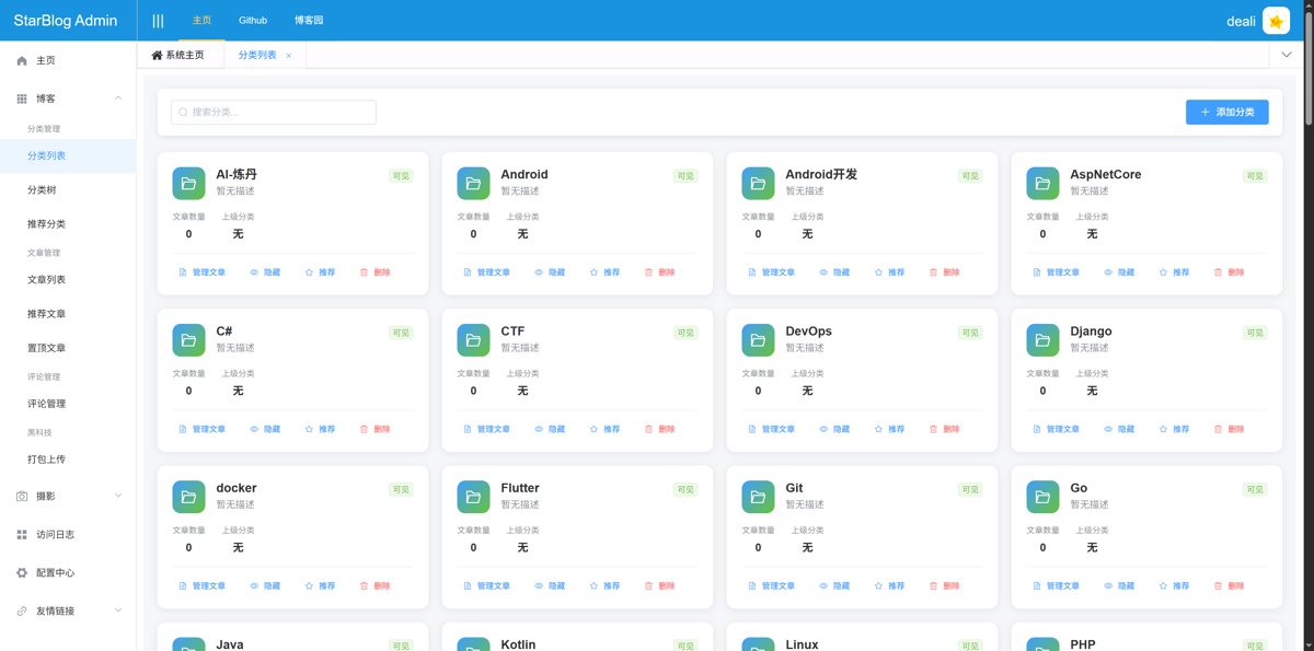
Category Tree
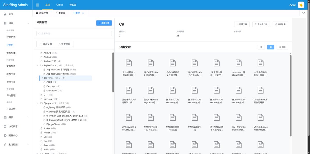
This is the truly user-friendly one.
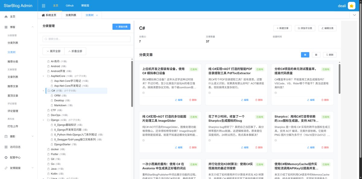
On the left is the category tree. Clicking a category node on the left allows you to view category details, and the right side will load and display the article list.
The article list can be displayed in two different styles. The current style is the icon style, similar to a file manager's layout.
There is also a card-style layout.
It's also worth mentioning the operations available for category nodes.
Hovering the mouse over each node reveals a menu.

The options are: Add Subcategory, Article List, Edit Category, and Delete.
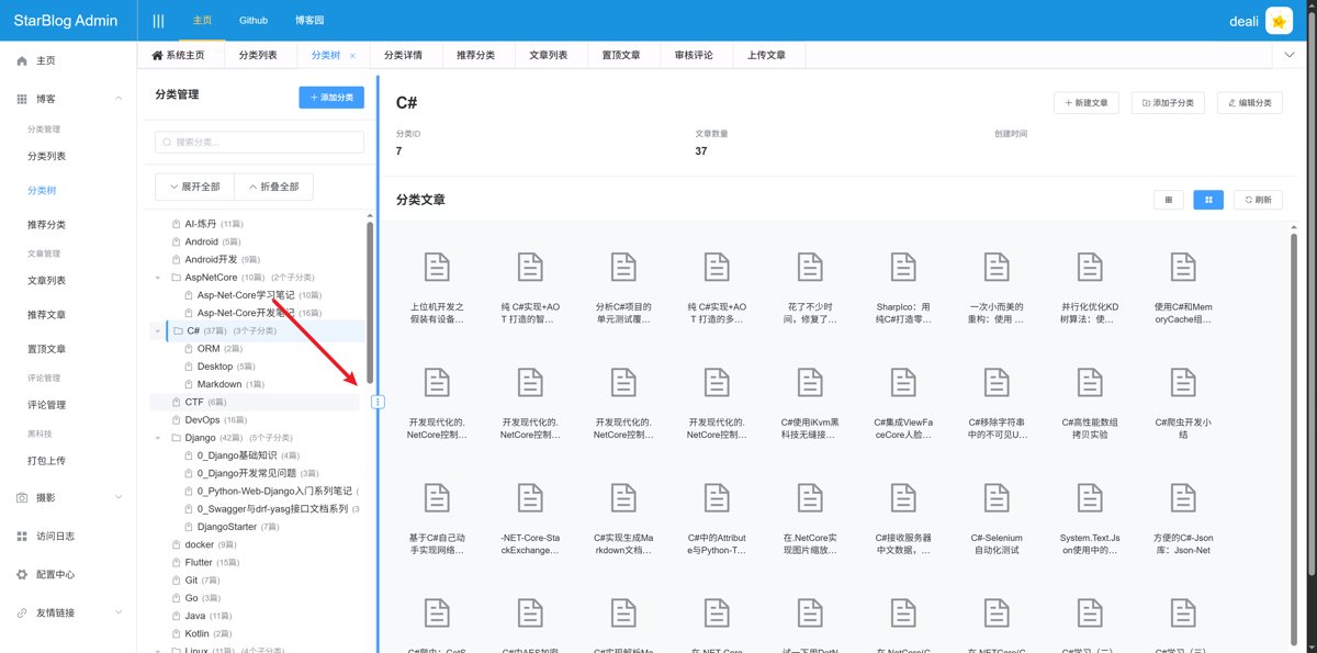
By the way, the divider in the middle of this page is adjustable, allowing you to change the width of the left and right columns.
Adding Subcategories
When adding, the parent category is automatically filled in, greatly enhancing the convenience of category management.

Category Article List
This new interface makes it very convenient to manage articles within a specific category.
Due to backend design requirements, articles cannot exist without a category.
Therefore, this feature primarily facilitates adding articles to a specific category.
It still uses a two-column layout.
The left column displays all articles and supports searching and filtering by category tree.
The right column shows articles in this category. Existing articles cannot be removed because articles must always have a category assigned.
However, newly added articles in the current editing session that have not yet saved can be removed.
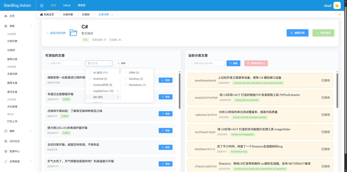
I used this feature to organize the articles under the "Linux" and "Unboxing Reviews" categories.
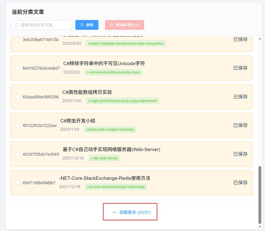
By the way, this interface also supports pagination loading. The interaction is a type of pull-up loading, where you can load the next page by scrolling to the bottom and clicking the "Load More" button.
Old Classification Page
Looking at the new features
Let's take a look at how poorly the old one was done
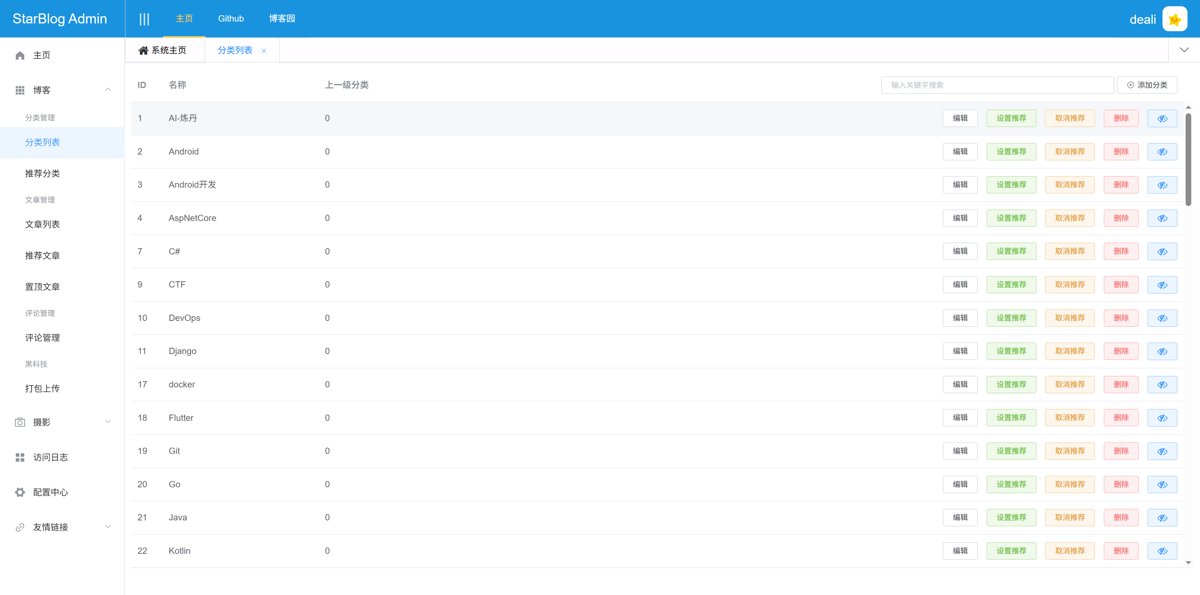
To call it rubbish might be an overstatement—after all, it does have basic CRUD operations for categories.
But it’s definitely not user-friendly.
It’s really just stuck at the database CRUD level.
In terms of functionality, it can be described as quite rudimentary.
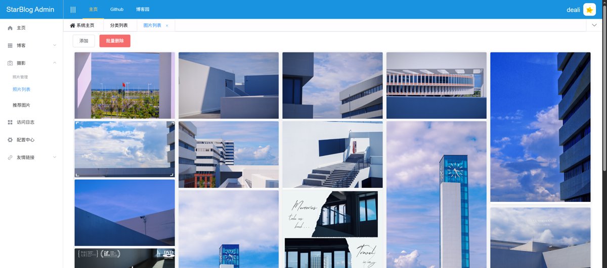
New Photo Wall Page
This is truly a major upgrade.
It now supports searching, filtering, and batch operations (like setting as recommended or deleting). You can also edit image information. Basically, all the essential features are included.
Previously, I used the vue-waterfall component, but it seems like it's either no longer maintained or incompatible with the Vue version used in this project, and modifying it led to quite a few bugs.
So, this time I hand-wrote a waterfall flow component based on Vue.
It's much better to use than vue-waterfall.
Old Version
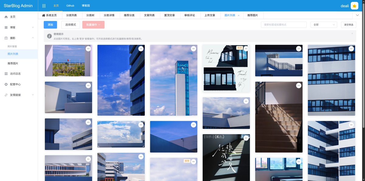
The old version looks like this - what the heck, this is the admin panel (管理后台), not the frontend display interface. How is it possible that only the display is shown while other features are all incomplete?
Summary
Honestly, the recent modifications to the backend don't quite qualify as a "major version update"; they're more like a "good enough" set of patches and fixes.
However, going through the process did give me a chance to re-examine the old code written years ago—there was definitely some cringe at my past self's work.
Although these temporary fixes will eventually need to be refactored, at least the backend is now usable for the time being.
When it comes to refactoring StarBlog in the future, the experience gained from this round will serve as lessons learned from pitfalls encountered along the way.
Sometimes, an imperfect solution is still a step on the path to perfection.
—— Xi Yuan · October 2025
_EOF_
StarBlog minor update, significant improvement in article management experience, rewrote several admin dashboard pages.
- 本文作者:
- 程序设计实验室
- 版权声明:
- 本博客所有文章除特别声明外,均采用 BY-NC-SA 许可协议。转载请注明出处!
相关文章
重写 StarBlog 的搜索功能和页面,支持权重设置和结果高亮
重写搜索?就内存算权重加Regex?太业余了。标题权重100倍正文?这种土味方案意外的有效。页面也重写了,但Bootstrap样式够原始的。 v2还指望用Lucene.NET?
2025-09-02 · StarBlog番外 · 约 1 分钟
StarBlog v1.3.0 新版本,一大波更新以及迁移服务器部署
服务器故障逼得更新,直接上云服务器迁移。v1.3.0版本来了,架构、界面、SEO全升级,还加了图片压缩工具,代码总算整理干净点。来看看这波大更新如何?
2025-08-19 · StarBlog番外 · 约 1 分钟
StarBlog番外(4) 文章一键发布工具Publisher大升级,AI功能增强与界面优化
《StarBlogPublisher》是一款提升博客与公众号文章创作效率的工具。作者在原有版本基础上进行了多项优化,包括界面调整(空间利用率更高、统一Font Awesome图标)及功能增强(新增文章Slug配置、独立的AI配置窗口、多组AI配置文件管理)。新功能支持AI模型动态加载、API Key灵活切换,显著提升大模型创作效率。作者计划持续开发AI辅助工具以解放生产力。
2025-05-18 · StarBlog番外 · 约 1 分钟
starblog-publisher 2.x 版本重构内容
搞了两个月终于拖出了个2.x重构——把CLI、Core、GUI拆得清清楚楚,就为迎合Agent潮流。微信文章排版也顺手打通了,发文章效率勉强能看。3.x怕是又要延期,毕竟精力总得分给太多方向。
2026-09-23 · StarBlog番外 · 约 1 分钟
讨论
共 0 条加载评论中…