StarBlog Blog Development Notes: Frontend Development (4) - FontAwesome Icons
In modern frontend development, icons have become crucial elements for building user-friendly interfaces. Font Awesome is one of the most popular icon libraries worldwide, offering a vast collection of vector icons that support multiple platforms and frameworks. Whether for websites, applications, or admin panels, Font Awesome helps developers effortlessly add intuitive and easily recognizable visual elements to their interfaces.
目录32 个章节
Preface
In modern front-end development, icons have become an essential element for building user-friendly interfaces. Font Awesome is one of the most popular icon libraries worldwide, offering a vast collection of vector icons that support multiple platforms and frameworks. Whether for websites, applications, or admin panels, Font Awesome helps developers easily add intuitive and easily recognizable visual elements to their interfaces.
For a demo project, Font Awesome is usually sufficient. The free version has a limited number of icons, but if you need more, you can check out the Alibaba Icon Library, which offers a comprehensive selection. However, try to maintain a consistent icon style.
This article will explain how to use the Font Awesome icon library in a Vue project.
About Font Awesome
Font Awesome is an open-source icon library that offers thousands of vector icons. It is widely used in the development of websites, applications, and admin interfaces. Its icons cover numerous areas, including social media, user interfaces, devices, directional indicators, business, and more, catering to virtually any development need.
The advantages of Font Awesome lie in its ease of use, flexibility, and compatibility with different devices and screen sizes. By using simple CSS classes, developers can embed these icons into web pages and freely adjust their size, color, rotation, and other styles through CSS or JavaScript.
Font Awesome offers two versions:
- Free: Includes a large number of commonly used icons suitable for most projects. These icons can be installed and used via CDN or NPM.
- Pro: This is the paid version, offering more advanced icons and features, such as animated icons and additional icon styles (e.g., brand icons). The Pro version requires purchasing a license to use.
PS: While developing frontend projects nowadays, although there are comprehensive icon libraries like react-icons, I still consider Font Awesome as an option. I'm used to it—it's large and comprehensive.
Installation
Font Awesome offers several ways to use it, most commonly through CDN (Content Delivery Network) and NPM (Node Package Manager).
NPM Installation
This project uses npm for installation, which is quite convenient.
yarn add @fortawesome/fontawesome-free
Edit src/main.js and add one line of code in the import section:
import 'font-awesome/css/font-awesome.min.css'
Using CDN Inclusion
Using a CDN is the simplest method, suitable for quick prototyping or small projects. By including Font Awesome via CDN, you don't need to install any packages. Simply add the Font Awesome CDN link to your HTML file, and you can use icons in your Vue components.
Open your project's public/index.html file.
Add the Font Awesome CDN link inside the <head> tag:
<link rel="stylesheet" href="https://cdnjs.cloudflare.com/ajax/libs/font-awesome/6.0.0-beta3/css/all.min.css">
Choose the Desired Icon
Open: https://fontawesome.com/v6/search?o = r&m = free
Enter keywords in the search box, for example, if you want a house icon, you can input 'home'
Click on the desired icon, a modal will pop up, and the code inside can be directly copied
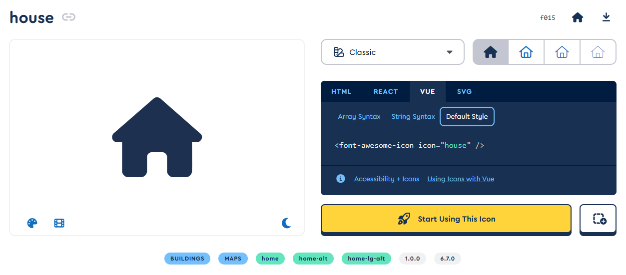
In a Vue project, mainly look at the code in HTML and Vue formats
Usage
Direct Use
Like CDN, use directly in Vue files.
This is also the approach chosen by this project
<i class="fa fa-user"></i>
On-demand Loading
On-demand loading can reduce the project size and improve performance.
If you only want to import the icons actually needed in your project, you can use this approach.
Edit src/main.js.
import { library } from '@fortawesome/fontawesome-svg-core';
import { faHome, faUser } from '@fortawesome/free-solid-svg-icons';
import { FontAwesomeIcon } from '@fortawesome/vue-fontawesome';

library.add(faHome, faUser);

// Register the FontAwesomeIcon component in Vue
Vue.component('font-awesome-icon', FontAwesomeIcon);
Use the on-demand loaded icons within components.
You can copy the icon code from the Font Awesome website.
<template>
  <div>
    <font-awesome-icon icon="home" />
    <font-awesome-icon icon="user" />
  </div>
</template>
Customization
Font Awesome provides a rich set of icon resources, but sometimes we want to adjust the size, color, rotation angle, and other properties of icons based on project requirements. With simple CSS or Vue data binding, you can easily customize Font Awesome icons to fit different design needs.
Adjusting Icon Size
Font Awesome offers several ways to adjust icon size, which can be achieved through CSS classes or inline styles.
Using Font Awesome Size Classes
Font Awesome provides several predefined size classes that can be easily applied to icons. Common size classes include:
fa-xs: Extra small iconfa-sm: Small iconfa-lg: Large iconfa-2x,fa-3x,fa-4x,fa-5x,fa-6x,fa-7x,fa-8x,fa-9x,fa-10x: Progressively larger icons
Example:
<template>
  <div>
    <i class="fa fa-home fa-3x"></i> <!-- 大号图标 -->
    <i class="fa fa-user fa-2x"></i> <!-- 中号图标 -->
  </div>
</template>
Customizing Icon Size with CSS
For more precise control, you can adjust the icon size using CSS:
<template>
  <div>
    <i class="fa fa-home" style="font-size: 50px;"></i> <!-- 自定义大小 -->
    <i class="fa fa-user" style="font-size: 30px;"></i> <!-- 自定义大小 -->
  </div>
</template>
This style can also be written into a separate CSS file or a Vue component's <style> block.
Changing Icon Colors
Changing the color of Font Awesome icons is also very simple. The icon's color is controlled using the CSS color property.
Using CSS Classes
Change the color directly within a Vue component using CSS classes:
<template>
  <div>
    <i class="fa fa-home" style="color: #3498db;"></i> <!-- Blue icon -->
    <i class="fa fa-user text-danger"></i> <!-- Using the red class provided by Bootstrap -->
  </div>
</template>
Using Custom CSS Colors
You can set the icon color directly via the style attribute or use a custom CSS class:
<template>
  <div>
    <i class="fa fa-home" style="color: red;"></i> <!-- Red icon -->
    <i class="fa fa-user custom-icon-color"></i> <!-- Custom color -->
  </div>
</template>

<style scoped>
.custom-icon-color {
  color: #2ecc71; /* Green */
}
</style>
Rotating and Flipping Icons
Font Awesome also allows controlling the rotation and flipping of icons through class names to achieve more dynamic effects.
Rotating Icons
Use fa-rotate-90, fa-rotate-180, fa-rotate-270 to rotate icons, with degrees as the unit.
Example:
<template>
  <div>
    <i class="fa fa-arrow-right fa-rotate-90"></i> <!-- Rotated 90 degrees -->
    <i class="fa fa-arrow-right fa-rotate-180"></i> <!-- Rotated 180 degrees -->
  </div>
</template>
Flipping Icons
Use fa-flip-horizontal and fa-flip-vertical to flip icons.
Example:
<template>
  <div>
    <i class="fa fa-arrow-right fa-flip-horizontal"></i> <!-- Horizontally flipped -->
    <i class="fa fa-arrow-right fa-flip-vertical"></i> <!-- Vertically flipped -->
  </div>
</template>
Dynamically Control Icon Size and Color (Using Vue Data Binding)
Through Vue's data binding, you can achieve more dynamic icon customization. For example, you can dynamically change the icon's size or color based on the application's state or user interaction.
Dynamic Size
Use Vue's v-bind directive to dynamically bind the icon's style or class:
<template>
  <div>
    <i :class="iconClass" :style="{ fontSize: iconSize + 'px' }"></i>
    <button @click="increaseSize">Increase Icon Size</button>
  </div>
</template>

<script>
export default {
  data() {
    return {
      iconSize: 30,  // 初始图标大小
      iconClass: 'fa fa-home',  // 图标类
    };
  },
  methods: {
    increaseSize() {
      this.iconSize += 10; // 每次点击按钮图标大小增大
    },
  },
};
</script>
Dynamic Color
Similarly, you can dynamically change the color by binding style or class:
<template>
  <div>
    <i :class="iconClass" :style="{ color: iconColor }"></i>
    <button @click="changeColor">Change Color</button>
  </div>
</template>

<script>
export default {
  data() {
    return {
      iconColor: 'red', // 初始颜色
      iconClass: 'fa fa-heart', // 图标类
    };
  },
  methods: {
    changeColor() {
      this.iconColor = this.iconColor === 'red' ? 'blue' : 'red'; // 切换颜色
    },
  },
};
</script>
Using Animation Effects
Font Awesome also supports some basic animation effects, such as fa-spin and fa-pulse:
fa-spin: Makes the icon rotate.fa-pulse: Makes the icon pulse.
Example:
<template>
  <div>
    <i class="fa fa-spinner fa-spin"></i> <!-- 旋转的图标 -->
    <i class="fa fa-heart fa-pulse"></i> <!-- 脉动效果 -->
  </div>
</template>
Best Practices
When using Font Awesome icons, following some best practices not only helps improve code quality but also enhances application performance and maintainability. Below are some recommended practices for using Font Awesome in Vue projects.
Using On-Demand Loading (Load by Icon)
If your project only uses a subset of Font Awesome icons, it is recommended to adopt on-demand loading. This can significantly reduce the amount of resources loaded and improve page load speed.
Using the Font Awesome Vue Component Library
Use the @fortawesome/vue-fontawesome library to load icons on demand instead of loading the entire Font Awesome library. This not only reduces the bundle size of your application but also enhances loading efficiency.
npm install --save @fortawesome/vue-fontawesome @fortawesome/free-solid-svg-icons @fortawesome/free-brands-svg-icons
Then, import icons on demand in your Vue component:
import { library } from '@fortawesome/fontawesome-svg-core';
import { faHome, faUser } from '@fortawesome/free-solid-svg-icons';
import { FontAwesomeIcon } from '@fortawesome/vue-fontawesome';

library.add(faHome, faUser);

Vue.component('font-awesome-icon', FontAwesomeIcon);
In this way, only the imported icons will be bundled into the application, not the entire icon library.
Avoid Overusing Icons
While Font Awesome offers a vast selection of icons, to ensure a good user experience and a clear interface, it is important to avoid using too many icons on a single page. An excessive number of icons can make the page look cluttered and affect usability.
- Keep icon usage concise and clear: Use icons to represent common actions or functions, such as "back," "settings," or "search." Avoid using too many icons, especially those that are not very common, and strive for consistency.
- Use icons in conjunction with text: Icons are best used alongside text labels, especially in buttons and navigation items. This helps users better understand the meaning of each action.
Use CSS Classes to Control Icon Styling
Try to avoid hardcoding the style attribute for icons directly in HTML. Extracting styles into CSS or Vue's <style> block makes the code cleaner and easier to maintain.
For example, you can use custom CSS classes to control the size, color, and other styles of icons:
<template>
  <div>
    <i class="fa fa-home icon-large"></i>
    <i class="fa fa-user icon-blue"></i>
  </div>
</template>

<style scoped>
.icon-large {
  font-size: 3rem;
}

.icon-blue {
  color: #3498db;
}
</style>
This not only makes the Vue component more concise but also makes the styles more modular, facilitating later modifications and extensions.
Maintain Consistency When Using Font Awesome Icons
When using Font Awesome, maintaining consistency in icon style is crucial. Ensure that icons of the same category use consistent size, color, and style. For example, all social media icons should use the same color, and all navigation icons should use the same size.
- Uniform size and color: Use uniform icon sizes to keep the interface tidy and avoid mixing excessively large and small icons.
- Group icons by usage: Use the same color and style for icons with similar functions (e.g., all social media icons or all action icons) to maintain visual consistency.
Improve Accessibility
When using Font Awesome icons, ensure good accessibility, especially to assist visually impaired users. Font Awesome provides the aria-label attribute to add appropriate text descriptions to icons, ensuring that screen readers can correctly interpret the meaning of the icons.
PS: I've noticed that domestic tutorials and materials rarely mention this point. In contrast, component libraries like Bootstrap and TailwindCSS have many components that consider accessibility.
For example:
<template>
  <div>
    <i class="fa fa-search" aria-label="Search"></i>
    <i class="fa fa-home" aria-label="Home"></i>
  </div>
</template>
By adding aria-label to each icon, you can ensure that the meaning of the icons is correctly conveyed to screen readers, thereby improving the accessibility of the application.
Optimize Icon Performance
Although Font Awesome provides many convenient ways to use icons, if the icon library is not properly optimized, it may lead to unnecessary resource waste. Therefore, consider the following optimization strategies:
- Use SVG icons: Font Awesome provides SVG-based icons, which are more suitable for responsive design than traditional font icons and can avoid rendering issues associated with font icons.
- On-demand loading: Avoid loading the entire Font Awesome library whenever possible, especially in large projects. Use on-demand loading to import only the icons that are actually used, as mentioned earlier with the Vue component approach.
- Minimize reliance on external CDNs: If your project heavily uses Font Awesome icons, it is recommended to include the icon library directly in your project rather than relying on external CDNs. This can avoid performance issues caused by network delays, especially in environments with poor network conditions.
Summary
Font Awesome is a powerful icon library that provides developers with thousands of high-quality vector icons, easily applicable to websites and applications. In this article, we briefly introduced how to use Font Awesome in a Vue project, covering everything from installation to customizing icons and best practices for using Font Awesome.
We covered two common methods to integrate Font Awesome into a Vue project: using CDN integration and NPM installation. For small projects or rapid prototyping, CDN integration is a simple and quick approach; for more complex applications, using NPM installation with on-demand icon loading can bring better performance optimization and flexibility.
In terms of icon customization, Font Awesome offers rich options, allowing developers to adjust icon properties such as size, color, and rotation through CSS or Vue data binding, making the icons more aligned with design requirements. Additionally, the appearance of icons can be controlled through CSS classes, inline styles, and Vue data binding.
Furthermore, there are some best practices such as on-demand loading, avoiding excessive use of icons, maintaining style consistency, and improving accessibility. These methods help enhance the performance, maintainability, and user experience of the application.
Overall, the combination of Font Awesome and Vue provides developers with powerful and flexible icon management functionality, making both interface design and user interaction smoother and more efficient during the development process. If you need an icon library for your project, Font Awesome is undoubtedly an excellent choice worth considering.
_EOF_
StarBlog Blog Development Notes: Frontend Development (4) - FontAwesome Icons
- 本文作者:
- 程序设计实验室
- 版权声明:
- 本博客所有文章除特别声明外,均采用 BY-NC-SA 许可协议。转载请注明出处!
相关文章
StarBlog博客开发笔记:前端开发(1)准备篇
环境准备 NodeJs 首先需要安装NodeJs 下载地址:http://nodejs.cn/download/ 安装前端工具链 国内使用NPM需要设置国内镜像才能正常安装,之前常用的淘宝镜像说是要停止解析了,可以用这个npmmirror 中国镜像,命令如下: npm config set registry https://registry.npmmirror.com npmmirror 中国镜像
2024-12-10 · StarBlog前端开发-Vue · 约 1 分钟
StarBlog博客开发笔记:前端开发(7)之主页面
界面设计 按照ElementUI提供的布局来 左边是导航栏,右边上方是标签页,然后是主内容区 如图 二级类目 开始写代码 主页面的内容已经比较复杂了,全部写在一个文件内不现实 我们来分解一下 根据这个布局,页面可以分为头部、主体、左侧导航栏三部分 所以我来新建三个vue页面 HeaderBar.vue Navbar.vue MainContent.vue 完成之后目录结构如下 views ├──
2023-07-14 · StarBlog前端开发-Vue · 约 1 分钟
StarBlog博客开发笔记:前端开发(6)之登录页面
前言 前端开发的准备工作在前面已经完成了,接下来就要开启写页面(Copy/Paste)操作了~ 用ElementUI写页面很简单,对照着官网文档代码一顿复制粘贴就完事了。 写代码 没啥好说的,直接代码 布局 template el-form :model=loginForm :rules=fieldRules ref=loginForm label-position=left label-wi
2023-07-14 · StarBlog前端开发-Vue · 约 1 分钟
StarBlog博客开发笔记:前端开发(5)之axios网络请求封装
安装axios axios是一个基于Promise用于浏览器和Node.js的HTTP客户端,我们后续需要用来发送HTTP请求,先来记录一下axios的安装和使用。 安装命令 yarn add axios 写代码 修改一下src/views/Home.vue 首先布局改一下 template div class=page h2Home Page/h2 el-alert
2025-03-27 · StarBlog前端开发-Vue · 约 1 分钟
讨论
共 0 条加载评论中…