StarBlog Blog Development Notes: Frontend Development (3) - SASS and SCSS
Foreword This project requires the use of SCSS to write page styles. Here, SASS refers to the CSS preprocessor named SASS. SCSS is a CSS-like syntax. For beginners, SCSS is fully compatible with CSS, which means there is virtually no learning curve. SCSS syntax is simply CSS with added features. This is important when working with inexperienced developers: they can start coding quickly without having to learn Sass first. Additionally, SCSS is easy to read because it is
目录16 个章节
Foreword
This project requires using SCSS to write page styles.
Sass (Syntactically Awesome Stylesheets) is a CSS preprocessor, and SCSS is a syntax format of Sass. It is fully compatible with CSS while extending its functionality, making style writing more efficient, flexible, and modular.
For beginners, SCSS is completely compatible with CSS, which means a nearly zero learning curve. The SCSS syntax is simply: it's just CSS with some added features. This is important when working with inexperienced developers: they can start coding quickly without having to learn Sass first.
Furthermore, SCSS is also easy to read because it is semantic, not symbolic. When you see
@mixin, you know it's a mixin declaration; when you see@include, you are referencing a mixin. It doesn't use any abbreviations, and everything becomes clear when you read it aloud.Also, almost all Sass tools, plugins, and demos are now developed based on the SCSS syntax. Over time, SCSS will become the preferred choice. For example, it's now hard to find a syntax highlighting plugin for Sass's indented syntax; usually, only SCSS is available.
This article uses the example of creating a 404 page to introduce the usage of SCSS.
About SCSS
Advantages of SCSS over CSS
- Modularity: Organize style files through variables, nesting, and imports (
@importor@use). - Maintainability: Reduces repetitive code, making it easier to maintain and modify.
- Compatibility: SCSS files are fully compatible with CSS files, allowing for a gradual transition.
- Powerful Features: Supports logical conditions (
@if), loops (@for), and functions (@function), among other functionalities.
Related Resources
-
SASS Official Website: https://sass-lang.com/
-
Chinese Documentation: https://www.sass.hk/docs/
Main Features of SCSS (SCSS的主要功能)
Variables
Variables allow you to store values like colors and font sizes for easy reuse and management.
// SCSS
$primary-color: #3498db;
$font-size: 16px;

body {
  color: $primary-color;
  font-size: $font-size;
}
Compiled CSS:
body {
  color: #3498db;
  font-size: 16px;
}
Nesting (嵌套)
SCSS supports nested syntax, making the style hierarchy clearer and closer to the HTML structure.
// SCSS
nav {
  ul {
    margin: 0;
    li {
      display: inline-block;
      a {
        text-decoration: none;
        color: $primary-color;
      }
    }
  }
}
The translated CSS:
nav ul {
  margin: 0;
}
nav ul li {
  display: inline-block;
}
nav ul li a {
  text-decoration: none;
  color: #3498db;
}
Mixins
Similar to functions, they allow you to define a reusable block of styles that can be included in multiple places.
// SCSS
@mixin flex-center {
  display: flex;
  justify-content: center;
  align-items: center;
}

.container {
  @include flex-center;
  height: 100vh;
}
Translated CSS:
.container {
  display: flex;
  justify-content: center;
  align-items: center;
  height: 100vh;
}
Inheritance (继承)
Use @extend to reuse existing styles.
// SCSS
.btn {
  padding: 10px 20px;
  border-radius: 5px;
}

.btn-primary {
  @extend .btn;
  background-color: $primary-color;
  color: white;
}
Translated CSS:
.btn {
  padding: 10px 20px;
  border-radius: 5px;
}
.btn-primary {
  padding: 10px 20px;
  border-radius: 5px;
  background-color: #3498db;
  color: white;
}
Operations
SCSS supports basic mathematical operations such as addition, subtraction, multiplication, and division.
// SCSS
$base-padding: 10px;

.box {
  padding: $base-padding * 2;
  margin: $base-padding / 2;
}
Translated CSS:
.box {
  padding: 20px;
  margin: 5px;
}
Installation
For many years, node-sass has been the mainstream choice in the JavaScript community. In reality, it is merely a wrapper for libsass in the Node.js environment. The actual work of compiling Sass files is done by libsass.
Many issues encountered while using node-sass are actually caused by libsass. Since libsass is implemented in C/C++, common problems include installation failures during the setup of node-sass, or the need to reinstall it after switching Node.js versions. If you're installing node-sass in Docker, you might also encounter build failures due to missing dependencies. Additionally, in some regions, network issues can prevent the download of the binary files required for node-sass, leading to build failures.
Now, the official Sass implementation uses Dart Sass as the primary choice:
Dart Sass is the primary implementation of Sass, which means it gets new features before any other implementation. It’s fast, easy to install, and it compiles to pure JavaScript which makes it easy to integrate into modern web development workflows.
Therefore, the installation commands are as follows:
yarn add sass --dev
yarn add sass-loader@7.1.0 --dev
Note that Vue2 uses webpack version 3.6.0, so the sass-loader here must use version 7.1.0.
(I spent a long time debugging the TypeError: this.getOptions is not a function error before finally fixing it.)
Configuration
Edit the rules tag under module in the build/webpack.base.conf.js file, and add the following configuration:
{
    test: /\.scss$/,
    loaders: ['style', 'css', 'sass']
}
Usage
Webpack Usage
This project is a Vue-based SPA (Single-Page Application). After writing the code, it is bundled by webpack into HTML, CSS, and JavaScript. The previous steps have also configured SASS, allowing you to write SCSS directly within
.vuefiles.
Simply set the lang attribute to scss in the <style> tag of your page code.
<style scoped lang="scss">

</style>
Here, I modified the src/views/404.vue page.
<template>
  <div class="site-wrapper site-page--not-found">
    <div class="site-content__wrapper">
      <div class="site-content">
        <h2 class="not-found-title">404</h2>
        <p class="not-found-desc">Sorry! The page you visited <em>is missing</em> ...</p>
        <el-button @click="$router.go(-1)">Go Back</el-button>
        <el-button type="primary" class="not-found-btn-gohome" @click="$router.push('/')">Go Home</el-button>
      </div>
    </div>
  </div>
</template>
The style code is as follows:
.site-wrapper.site-page--not-found {
  position: absolute;
  top: 60px;
  right: 0;
  bottom: 0;
  left: 0;
  overflow: hidden;

  .site-content__wrapper {
    padding: 0;
    margin: 0;
    background-color: #fff;
  }

  .site-content {
    position: fixed;
    top: 15%;
    left: 50%;
    z-index: 2;
    padding: 30px;
    text-align: center;
    transform: translate(-50%, 0);
  }

  .not-found-title {
    margin: 20px 0 15px;
    font-size: 8em;
    font-weight: 500;
    color: rgb(55, 71, 79);
  }

  .not-found-desc {
    margin: 0 0 30px;
    font-size: 26px;
    text-transform: uppercase;
    color: rgb(118, 131, 143);

    > em {
      font-style: normal;
      color: #ee8145;
    }
  }

  .not-found-btn-gohome {
    margin-left: 30px;
  }
}
The page effect after the modification:
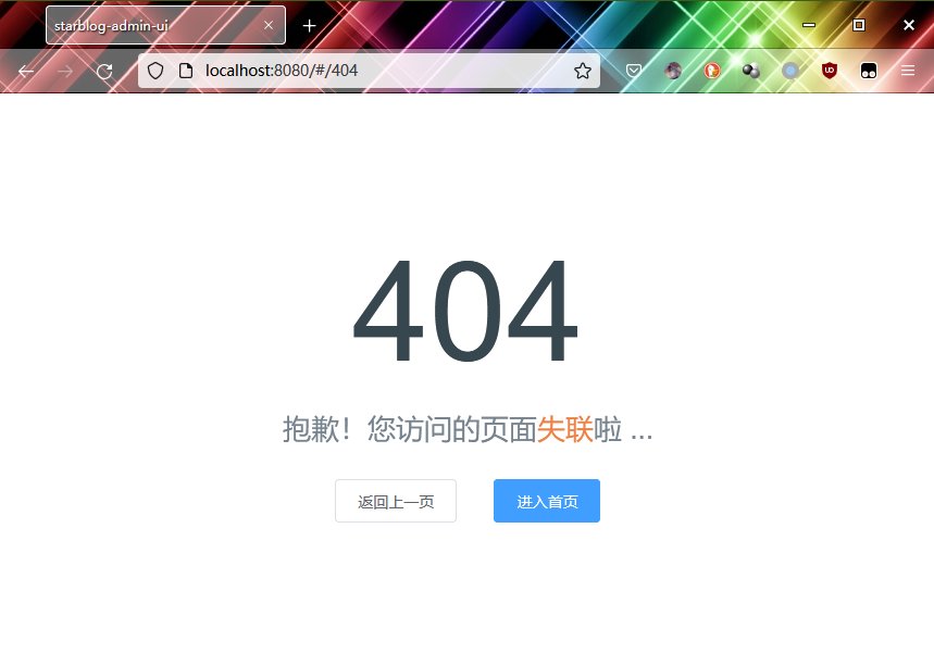
Looks good, all done~
Usage without Webpack
If you want to use SCSS standalone, you can directly invoke the SASS compilation:
sass styles.scss styles.css
Then include it in your HTML:
<link rel="stylesheet" href="styles.css">
References
- What is the relationship between Sass and SCSS? - https://segmentfault.com/a/1190000005646206
- Switching a VueCli3 project from node-sass to dart-sass - https://segmentfault.com/a/1190000039801096
- Switching a VueCli2 project from node-sass to dart-sass - https://juejin.cn/post/6844903842945957896
_EOF_
StarBlog Blog Development Notes: Frontend Development (3) - SASS and SCSS
- 本文作者:
- 程序设计实验室
- 版权声明:
- 本博客所有文章除特别声明外,均采用 BY-NC-SA 许可协议。转载请注明出处!
相关文章
StarBlog博客开发笔记:前端开发(7)之主页面
界面设计 按照ElementUI提供的布局来 左边是导航栏,右边上方是标签页,然后是主内容区 如图 二级类目 开始写代码 主页面的内容已经比较复杂了,全部写在一个文件内不现实 我们来分解一下 根据这个布局,页面可以分为头部、主体、左侧导航栏三部分 所以我来新建三个vue页面 HeaderBar.vue Navbar.vue MainContent.vue 完成之后目录结构如下 views ├──
2023-07-14 · StarBlog前端开发-Vue · 约 1 分钟
StarBlog博客开发笔记:前端开发(4)之FontAwesome图标
在现代前端开发中,图标已成为构建用户友好界面的重要元素。Font Awesome 是全球最流行的图标库之一,提供了大量的矢量图标,支持多种平台和框架。无论是网站、应用程序,还是管理面板,Font Awesome 都能帮助开发者轻松地为界面增添直观且易于识别的视觉元素。
2025-02-13 · StarBlog前端开发-Vue · 约 1 分钟
StarBlog博客开发笔记:前端开发(8)之vuex与状态管理
状态管理 在很多应用场景下,我们需要在组件之间共享状态,比如我们的左侧导航栏需要收缩和展开的功能,收缩状态时宽度很小,只显示菜单图标,因为导航菜单栏收缩之后宽度变了,所以右侧的主内容区域要占用导航栏收缩的空间,主内容区域宽度也要根据导航栏的收缩状态做变更,而导航栏和主内容区域是两个不同的组件,而非父子组件之间不支持状态传递,所以组件之间的状态共享问题发生了。 之前我写flutter的时候,响应式设
2023-07-14 · StarBlog前端开发-Vue · 约 1 分钟
StarBlog博客开发笔记:前端开发(6)之登录页面
前言 前端开发的准备工作在前面已经完成了,接下来就要开启写页面(Copy/Paste)操作了~ 用ElementUI写页面很简单,对照着官网文档代码一顿复制粘贴就完事了。 写代码 没啥好说的,直接代码 布局 template el-form :model=loginForm :rules=fieldRules ref=loginForm label-position=left label-wi
2023-07-14 · StarBlog前端开发-Vue · 约 1 分钟
讨论
共 0 条加载评论中…