

Change Cursor's Sidebar Position to Match VSCode's Style
Cursor puts the sidebar icons at the top? You can't quickly collapse it, and extra plugin icons don't even fit—pure differentiation for its own sake. Switching back to VSCode's familiar vertical sidebar is a one-line config change. Did the original author really need to spend so long criticizing it?
目录3 个章节
Introduction
Cursor's default sidebar is hard to use. I don't know why they put the navigation icons at the top—it feels like a pointless change made just to differentiate from VSCode.
Criticizing Cursor
Putting the navigation icons in a horizontal row at the top has several problems:
- You can't click an icon to quickly collapse the sidebar; after collapsing, the sidebar disappears completely
- Only 4 icons can be shown at a time; extra icons can't be displayed (e.g. Remote, Grok Build, and other extensions)
Take a look at the result after the change—the difference is obvious. The familiar muscle memory from using VSCode is back.
| Before | After |
|---|---|
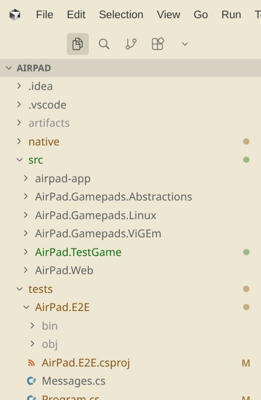 | 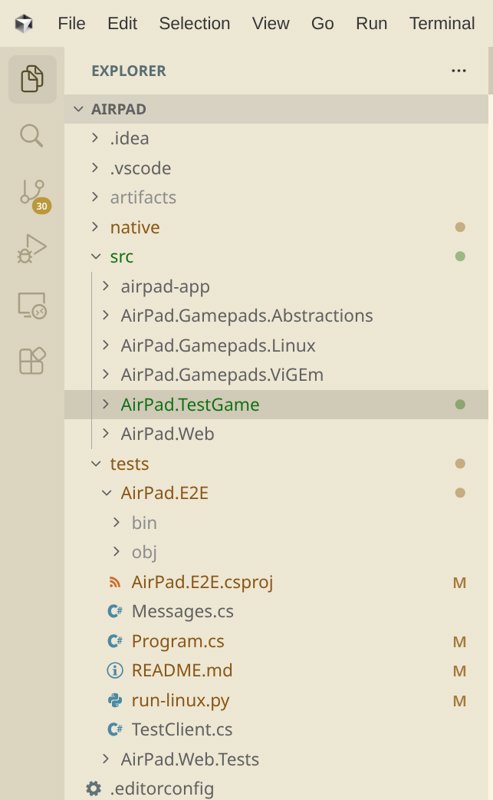 |
How to Change It
It's simple—just add this line to the config file:
"workbench.activityBar.orientation": "vertical"
After that you'll be prompted to restart Cursor; once you restart, you're done.
_EOF_
Change Cursor's Sidebar Position to Match VSCode's Style
- 本文作者:
- 程序设计实验室
- 版权声明:
- 本博客所有文章除特别声明外,均采用 BY-NC-SA 许可协议。转载请注明出处!
相关文章
浅谈次世代代码编辑器 Zed:Rust 原生性能、GPU 渲染
Zed?一群老司机在 Atom 失败后,用 Rust 重新造轮子?性能确实骚,GPU 渲染的丝滑感 VSCode 始终没学会。协作功能也挺有意思,但插件生态暂时还够看?
2026-03-25 · IDE · 约 1 分钟
从 WebStorm 转到 VSCode!使用一周体验报告
JetBrains 开源门槛提高?被迫转 VSCode,体验槽点满满:路径识别弱,自动引入加错后缀,标签不自动关闭,控制面板还无法折叠。轻量响应快,但细节反人类,免费还要啥自行车?
2024-01-28 · IDE · 约 1 分钟
解决 VSCode 的自动换行问题
VSCode 的 Markdown 自动换行看似简单,中文字体一上场就开始装死。问题根源是 `simple` 策略计算失准,改用 `advanced`,再配合 `wordWrap: on`,终于不用拖横向滚动条欣赏长句了。
2026-09-05 · IDE · 约 1 分钟
2026年AI编程工具横评:Cursor、Codex、Claude Code、Zed、Windsurf
Cursor还稳坐江山?Windsurf的Agent面板真那么神?Zed快是快,但AI功能跟不跟得上潮流再说。2026年选IDE,光看单点优势够呛,组合拳才王道——Cursor生态强还是Windsurf Agent管理顺?Codex细致度抵不过Claude Code速度?别傻了,工具好不好用,看的是能不能让你少写点代码。
2026-04-13 · IDE · 约 1 分钟
讨论
共 0 条加载评论中…