

Android Development: Using CardView to Implement Card-Style Design
Start by quoting an introduction from the official website A FrameLayout with a rounded corner background and shadow. CardView uses elevation property on Lollipop for shadows and falls back to a custom emulated shadow implementation on older platf
目录12 个章节
Start by quoting an introduction from the official website
A FrameLayout with a rounded corner background and shadow.
CardView uses
elevationproperty on Lollipop for shadows and falls back to a custom emulated shadow implementation on older platforms.Due to expensive nature of rounded corner clipping, on platforms before Lollipop, CardView does not clip its children that intersect with rounded corners. Instead, it adds padding to avoid such intersection (See setPreventCornerOverlap(boolean) to change this behavior).
Before Lollipop, CardView adds padding to its content and draws shadows to that area. This padding amount is equal to
maxCardElevation + (1 - cos45) * cornerRadiuson the sides andmaxCardElevation * 1.5 + (1 - cos45) * cornerRadiuson top and bottom.Since padding is used to offset content for shadows, you cannot set padding on CardView. Instead, you can use content padding attributes in XML or setContentPadding(int, int, int, int) in code to set the padding between the edges of the CardView and children of CardView.
Note that, if you specify exact dimensions for the CardView, because of the shadows, its content area will be different between platforms before Lollipop and after Lollipop. By using api version specific resource values, you can avoid these changes. Alternatively, If you want CardView to add inner padding on platforms Lollipop and after as well, you can callsetUseCompatPadding(boolean) and pass
true.To change CardView's elevation in a backward compatible way, use setCardElevation(float). CardView will use elevation API on Lollipop and before Lollipop, it will change the shadow size. To avoid moving the View while shadow size is changing, shadow size is clamped by getMaxCardElevation(). If you want to change elevation dynamically, you should call setMaxCardElevation(float) when CardView is initialized.
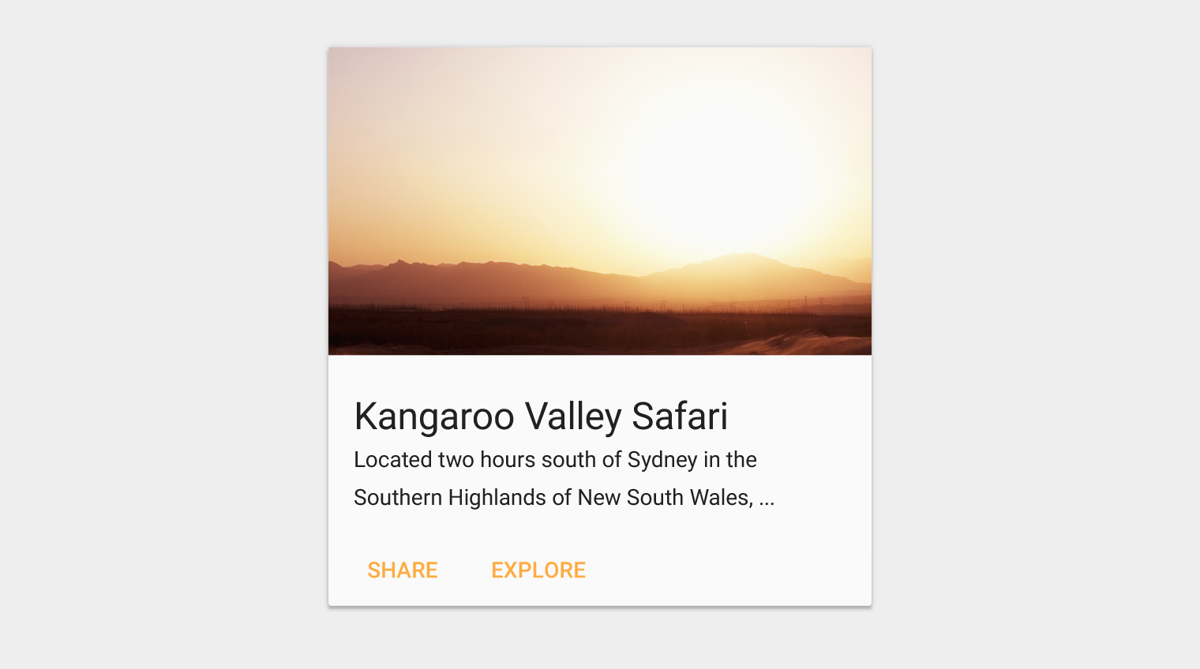
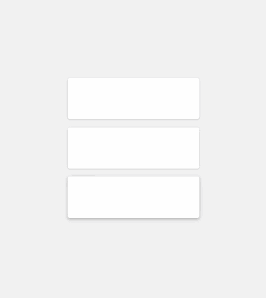
Simple preview:
Brief introduction
Apps often need to display data in similarly styled containers. These containers are often used in lists to hold each item's information. The system provides the CardView API as an easy way for you show information inside cards that have a consistent look across the platform. These cards have a default elevation above their containing view group, so the system draws shadows below them. Cards provide an easy way to contain a group of views while providing a consistent style for the container.
Getting started
- Add the dependencies
The CardView widget is part of the v7 Support Libraries. To use it in your project, add the following dependency to your app module's
build.gradlefile:
CardView was only introduced in Android 5.0, so you need to import this dependency package.
dependencies {
    implementation 'com.android.support:cardview-v7:27.1.1'
}
- Create Cards
In order to use the CardView you need to add it to your layout file. Use it as a view group to contain other views. In this example, the CardView contains a single TextView to display some information to the user.
The XML code is the same as the one analyzed earlier, so it will not be repeated here.
The cards are drawn to the screen with a default elevation, which causes the system to draw a shadow underneath them. You can provide a custom elevation for a card with the card_view:cardElevation attribute. This will draw a more pronounced shadow with a larger elevation, and a lower elevation will result in a lighter shadow. CardView uses real elevation and dynamic shadows on Android 5.0 (API level 21) and above and falls back to a programmatic shadow implementation on earlier versions.
Use these properties to customize the appearance of the CardView widget:
- To set the corner radius in your layouts, use the
card_view:cardCornerRadiusattribute. - To set the corner radius in your code, use the
CardView.setRadiusmethod. - To set the background color of a card, use the
card_view:cardBackgroundColorattribute.
For more information, see the API reference for CardView.
For Card design guidelines, you can refer to the official introduction: https://material.google.com/components/cards.html#
To better implement this Cards UI design, Google introduced a brand-new widget in the v7 package: CardVew. This article will introduce some common usage details of CardView from a development perspective.
Google describes CardView in one sentence: a FrameLayout with a rounded-corner background and shadow. CardView is well adapted on Android Lollipop (API 21) and later. In this article, we will use a concrete example to learn the basic usage of CardView and points to watch out for. The preview is as follows:
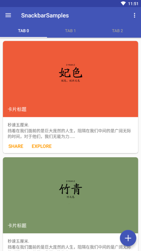
This is a list. The items in the list use a card-style design, implemented mainly with the CardView widget. Below we analyze the core code of the layout file.
<LinearLayout xmlns:android="http://schemas.android.com/apk/res/android"
    xmlns:tools="http://schemas.android.com/tools"
    xmlns:card_view="http://schemas.android.com/apk/res-auto"
    ... >
    <!-- A CardView that contains a TextView -->
    <android.support.v7.widget.CardView
        xmlns:card_view="http://schemas.android.com/apk/res-auto"
        android:id="@+id/card_view"
        android:layout_gravity="center"
        android:layout_width="200dp"
        android:layout_height="200dp"
        card_view:cardCornerRadius="4dp">

        <TextView
            android:id="@+id/info_text"
            android:layout_width="match_parent"
            android:layout_height="match_parent" />
    </android.support.v7.widget.CardView>
</LinearLayout>
As you can see, the core lies in using CardView's attributes. Below we will analyze several special attributes one by one to deepen our understanding.
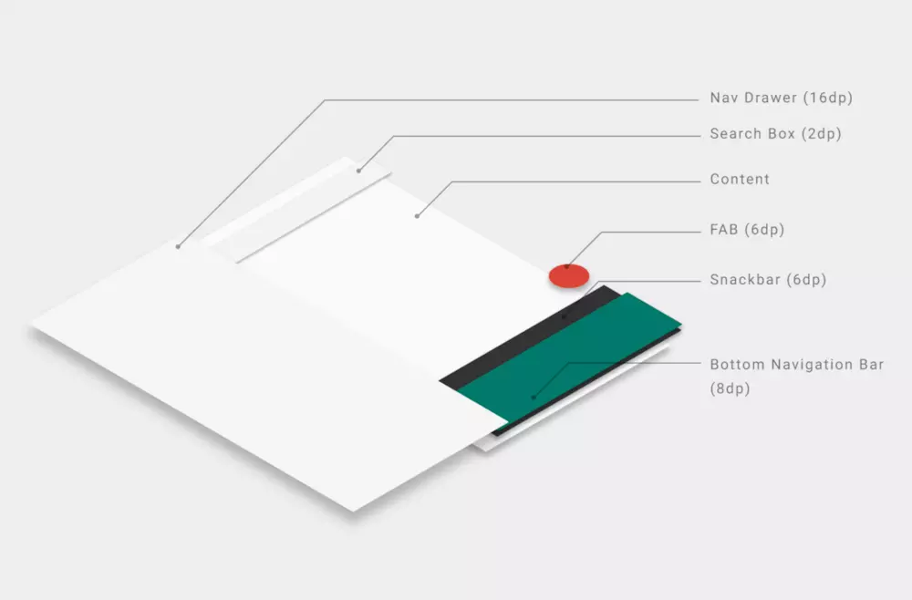
About the Z-Axis
Android 5.0 introduced the concept of the Z-axis, which allows components to present a 3D effect.
Layout Tips
As we mentioned earlier, CardView is essentially a FrameLayout, and CardView typically contains quite a few content elements. To conveniently lay out the various elements, we generally rely on other basic layout containers. For example, here we used a RelativeLayout as CardView's only Child.
Shadow Padding
On systems before Android Lollipop, CardView automatically adds some extra padding space to draw the shadow, which also causes CardView to have different sizes on different systems with Lollipop as the dividing line. To solve this problem, there are two methods: the first is to adapt using dimension resources for different API versions (that is, by means of different dimens.xml files in the values and values-21 folders); the second is to use the cardUseCompatPadding attribute, set to true (the default value is false), so that CardView uses the same padding values across different systems.
Corner Overlap
This is also a system compatibility issue. On pre-Lollipop platforms (before API 21), CardView does not clip content elements to meet rounded-corner requirements, but instead uses the alternative of adding padding so that content elements do not overlay CardView's rounded corners. The attribute that controls this behavior is cardPreventCornerOverlap, whose default value is true. In this example we set this attribute to false. Here let's look at a comparison of the effects with different cardPreventCornerOverlap values on pre-Lollipop platforms (false on the left, true on the right):
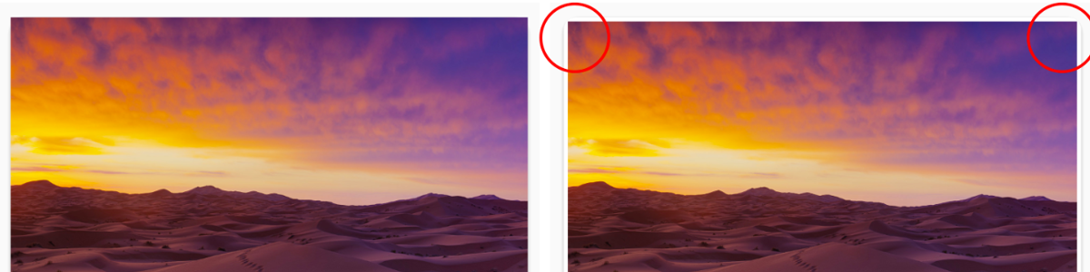
Clearly, the approach of automatically adding padding under the default value is not advisable, so this attribute needs to be set to false. One thing to note is that setting this attribute has no effect on Lollipop and later systems, unless the value of cardUseCompatPadding is true.
Ripple Effect
Cards are generally clickable. For this we used the foreground attribute with the system's selectableItemBackground value, and also set clickable to true (if you used cardView.setOnClickListener in Java code, you don't need to write the clickable attribute), thereby achieving a ripple effect (Ripple) on click on Lollipop and later systems. On pre-Lollipop versions, it is an ordinary click-to-darken effect.
lift-on-touch
According to the guidance on interaction motion specifications in the Material motion section of the official site, views such as Cards and Buttons should have a lift-on-touch interaction effect, that is, displacement along the Z-axis in 3D space, thereby producing a deepening shadow effect. Used together with the Ripple effect, the official site provides a very good example image:
Implementing this effect is also quite simple. You can create a lift_on_touch.xml file in the res/drawable directory, with the following content:
<?xml version="1.0" encoding="utf-8"?>
<!-- animate the translationZ property of a view when pressed -->
<selector xmlns:android="http://schemas.android.com/apk/res/android">
    <item
        android:state_enabled="true"
        android:state_pressed="true">
        <set>
            <objectAnimator
                android:duration="@android:integer/config_shortAnimTime"
                android:propertyName="translationZ"
                android:valueTo="6dp"
                android:valueType="floatType"/>
        </set>
    </item>
    <item>
        <set>
            <objectAnimator
                android:duration="@android:integer/config_shortAnimTime"
                android:propertyName="translationZ"
                android:valueTo="0"
                android:valueType="floatType"/>
        </set>
    </item>
</selector>
That is, dynamically changing the translationZ value through property animation, varying along the Z-axis from 0dp to 6dp. The 6dp value here also has a source; refer to the Google I/O 2014 app and Assign Elevation to Your Views. Then simply assign it to the android:stateListAnimator attribute. Since the stateListAnimator attribute only applies to Lollipop and later versions, to hide the version warning in the XML, you can specify tools:targetApi="lollipop".
Regarding this feature, one additional point needs to be explained. Strictly speaking, this lift_on_touch.xml is an anim resource and also applies to API 21 and later, so in principle it should be placed in the res/anim-v21 directory, then assigned to the stateListAnimator attribute using @anim/lift_on_touch, rather than the @drawable/lift_on_touch method in the example. However, placing it in the res/anim-v21 directory will produce an "error" prompt:
<selector style="box-sizing: border-box;">XML file should be in either “animator” or “drawable”,not “anim”</selector>
Although this "error" does not affect compilation and running, it is still an eyesore for programmers who pursue perfectionism, so in this example I chose to place it in the res/drawable directory. You can decide for yourselves how to use it.
Regarding understanding of the lift-on-touch effect, there is a video explanation on the YouTube website. If you're interested, you can take a look. The address is as follows: DesignBytes: Paper and Ink: The Materials that Matter
Summary
CardView also has some other attributes available, such as cardElevation to set the shadow size, contentPadding as a substitute for the ordinary android:padding attribute, and so on. These are fairly basic, so this article will not introduce them one by one; you can refer to the official site to learn. From the introduction above, you can see that when using CardView you will basically always use some standard configuration attributes. We can use the style attribute to encapsulate them into a styles.xml file for unified management, for example:
<style name="AppCardView" parent="@style/CardView.Light">
        <item name="cardPreventCornerOverlap">false</item>
        <item name="cardUseCompatPadding">true</item>
        <item name="android:foreground">?attr/selectableItemBackground</item>
        <item name="android:stateListAnimator" tools:targetApi="lollipop">@anim/lift_up</item>
        ......
</style>
References
- Google official documentation https://developer.android.com/reference/android/support/v7/widget/CardView
- Google official documentation https://developer.android.com/guide/topics/ui/layout/cardview
- http://yifeng.studio/2016/10/18/android-cardview/
- https://www.jianshu.com/p/b105019028b6
- http://www.jcodecraeer.com/a/anzhuokaifa/androidkaifa/2015/1025/3621.html
Welcome to Connect with Me
- Live coding room: https://live.bilibili.com/11883038
- WeChat official account: DealiAxy
- Zhihu: https://www.zhihu.com/people/dealiaxy
- Jianshu: https://www.jianshu.com/u/965b95853b9f
_EOF_
Android Development: Using CardView to Implement Card-Style Design
- 本文作者:
- 程序设计实验室
- 版权声明:
- 本博客所有文章除特别声明外,均采用 BY-NC-SA 许可协议。转载请注明出处!
相关文章
Android开发:在Linux系统上使用ADB连接Android手机
前言 由于 Linux 系统的安全性设置等原因,非 root 用户使用外部设备或者某些硬件接口会受到限制。Google 官方提供的 SDK 并不能直接工作,如找不到设备或者显示一堆问号以及 Permission Denied。 方法 记得以前有看过 Google 官方提供的解决方案,即将指定的 USB 设备读写权限赋予普通用户。 首先使用 lsusb 命令查看连接到计算机的 usb 设备,找到 A
2021-12-18 · Android开发 · 约 1 分钟
Android开发:解决在Linux上提示-dev-kvm-device-permission-denied问题
操作步骤 我用的是Ubuntu系统,首先需要安装qemu-kvm: sudo apt install qemu-kvm 将当前用户添加到kvm用户组: sudo adduser $USER kvm 检查/dev/kvm所有者: ls -al /dev/kvm 一般结果就是所有者是root以及kvm这个组 添加完了之后检查一下kvm组里有没有你的用户名: grep kvm /etc/group 一般
2021-12-18 · Android开发 · 约 1 分钟
该死的应用闪退,终于解决error-while-inflating-CardView
前言 (先来一个微笑脸)这个问题已经困扰我好久了,之前各种搜索无果,得到的解决方案无非就是 AppCompact 和 CardView 包的版本不一样云云,然而我根本没有这个问题。(怕是不把我Gradle看在眼里?) 问题 就是这么个界面,用到了RecycleView和Cardview,但是在SDK 23以下都不行,官方已经写明这个组件是支持到SDK9还是10的,反正基本是个android手机就可
2022-08-22 · Android开发 · 约 1 分钟
Android-Studio-插件记录
GsonFormat https://blog.csdn.net/leejizhou/article/details/50557786 ButterKnifeZelezny http://blog.csdn.net/leejizhou/article/details/50541356 SQLScout SQLite调试神器。 http://www.idescout.com/ https://plu
2021-12-18 · Android开发 · 约 1 分钟
讨论
共 0 条加载评论中…